You can now customize the behavior and appearance of the Left Navigation Bar in your developer portal. The new options include two navigation modes and three layout variations that give you more control over how navigation is structured and displayed.
What’s New
The Left Navigation Bar now supports:
- Two navigation modes
- Three layout variations
These settings work together to define both how top-level items are grouped and how first-level sections behave when the page loads.
Navigation Modes
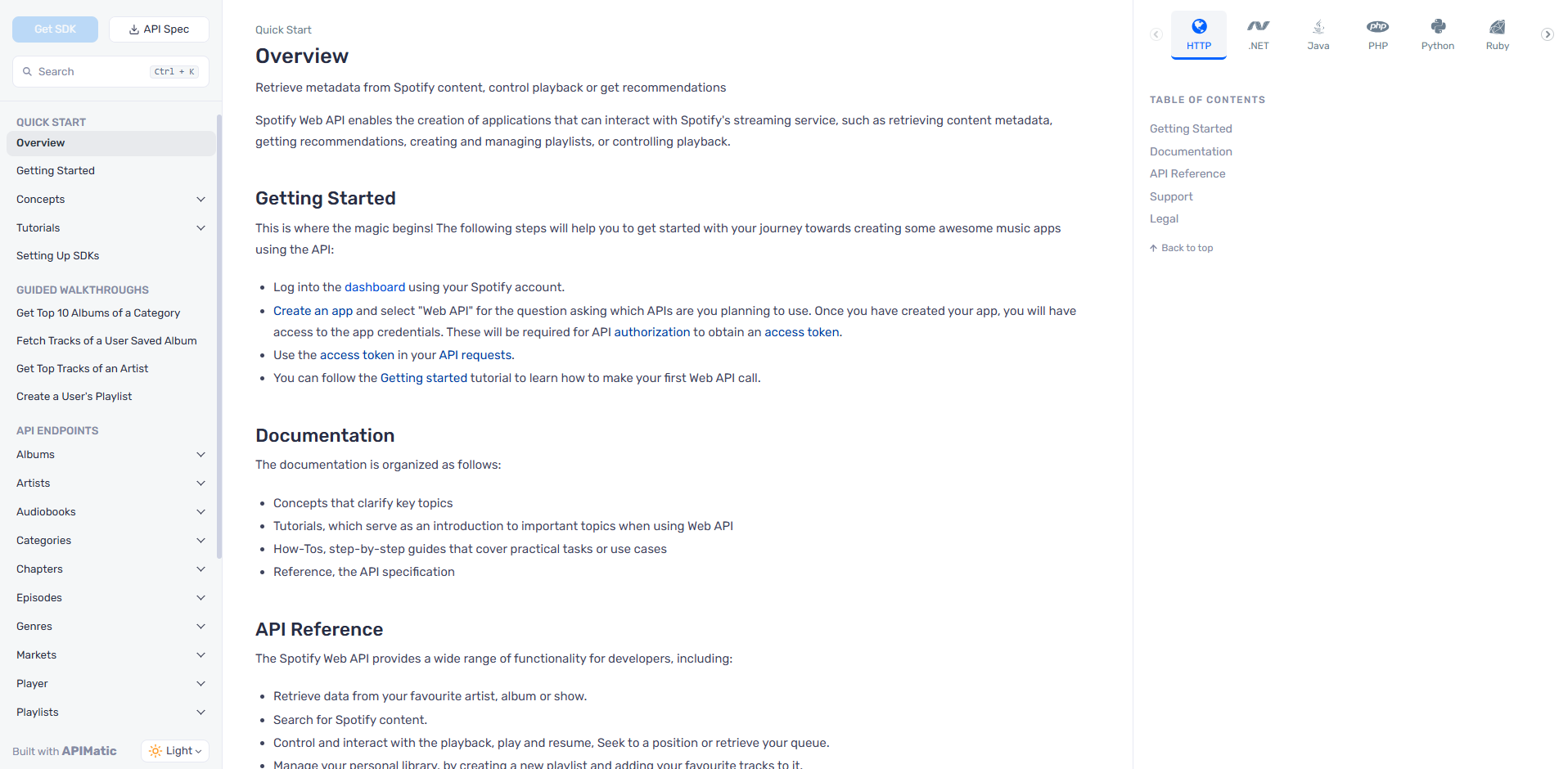
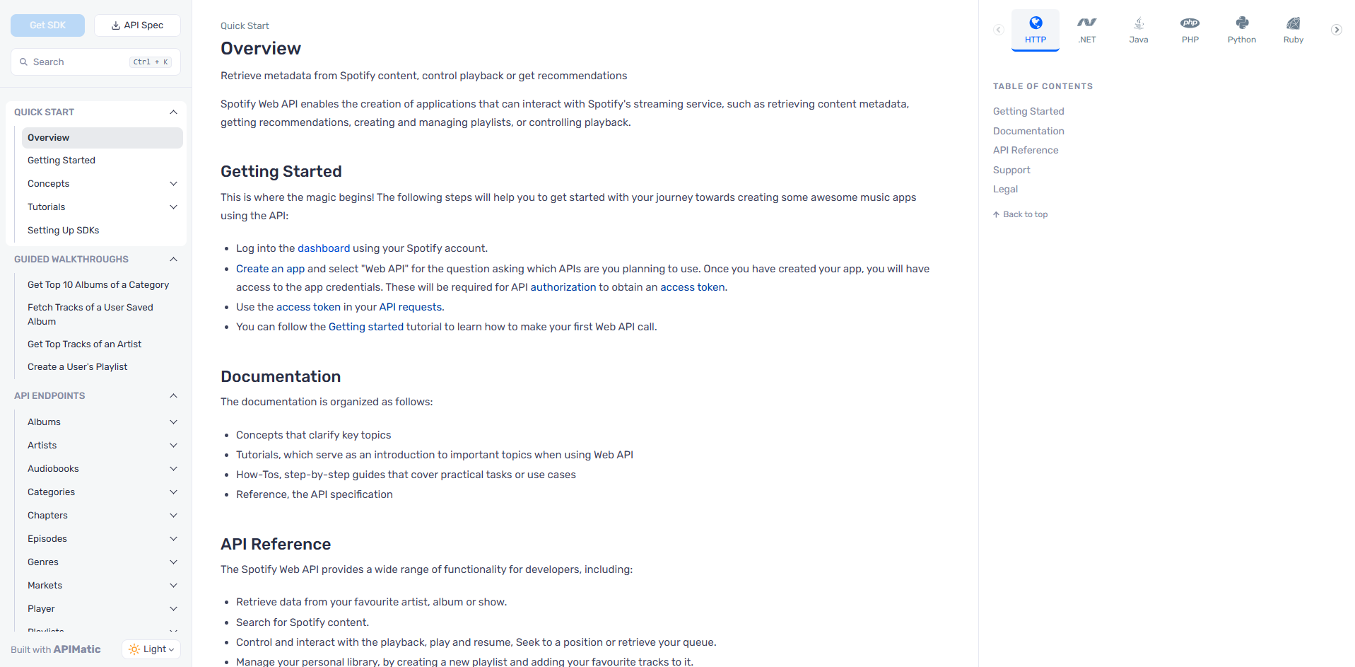
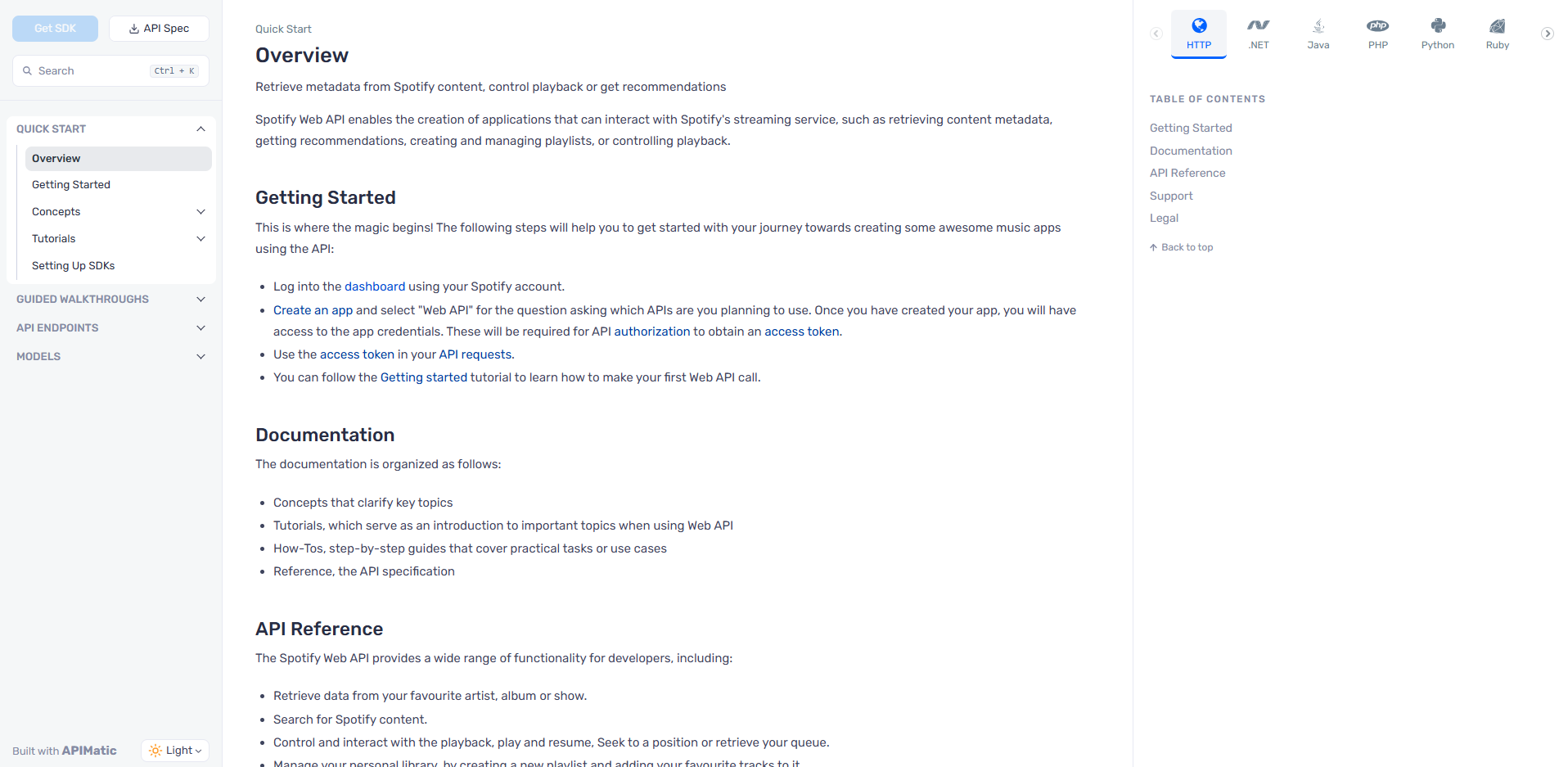
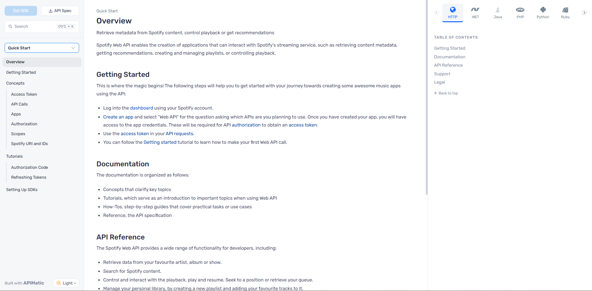
standard: Displays all navigation items in a vertical list, including nested levels.dropdown: Groups top-level (level 0) navigation items in a dropdown menu. Child items are shown based on the selected item.
Layout Variations
Layout variations define the on-load behavior of first-level sections (the sections nested under top-level items):
basic: All first-level sections are visible and not collapsible.expanded: All first-level sections are visible and can be collapsed by the user.collapsed: All first-level sections are collapsed by default and can be expanded by the user.
These options are only supported in the theme configuration. They are not available with themeOverrides.
Sidebar Layout Previews
Standard Mode
- Basic
- Expanded
- Collapsed
Dropdown Mode
- Basic
- Expanded
- Collapsed
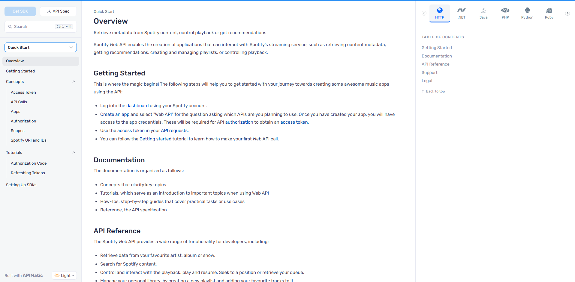
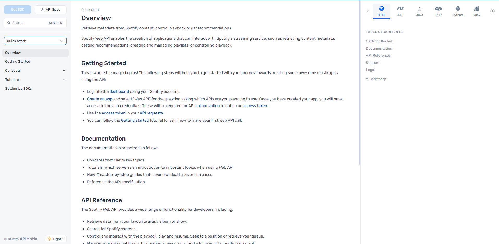
Configuration Example
Use the following structure to configure the Left Navigation Bar in your portal theme:
theme: {
  layout: {
    sidebar: {
      mode: "standard", // or "dropdown"
      variation: "basic" // or "expanded", "collapsed"
    }
  }
}
For full configuration details, see the theme layout configuration reference.
Deprecation Notice
The portalSettings.sideMenuTitleBehavior flag is now deprecated. It was previously used to control the collapsed state of top-level navigation items.
You should now use:
theme.layout.sidebar.modetheme.layout.sidebar.variation
Update your configuration to ensure consistency and to take advantage of the new behavior options.