Previously, building UI elements like cards, accordions, or tabs in the API Developer Portal required writing raw HTML, which was not ideal for maintainability and lacked support for built-in theming (e.g., Light, Dark, and Cosmos themes).
With this release, we’ve introduced native support for custom components, allowing you to create richer, more structured, and theme-consistent documentation without relying on raw HTML.
Supported Components
- Callout: Highlight important messages with contextual styling options including info, warning, danger, and success states.
- Card & Card Group: Showcase key information in clean, grid-based layouts for organised content presentation.
- Tabs: Organise content into switchable sections for improved navigation and space efficiency.
- Code Block Group: Display code samples across multiple programming languages in organised, tabbed interfaces.
- Accordion/Accordion Group: Create collapsible sections to organise content hierarchically and improve page readability.
- Frame: Embed images with captions and enhanced visual demonstrations.
- Video: Embed videos seamlessly from YouTube and Vimeo platforms.
- Mermaid: Visualise workflows, system architecture, and complex processes through interactive diagrams.
These additions are part of our ongoing effort to make the API Developer Portal more dynamic, customizable, and developer-friendly.
How to Use
Use the new components directly within your markdown using custom tags. Here are a few examples:
Accordion
- Syntax
- Preview
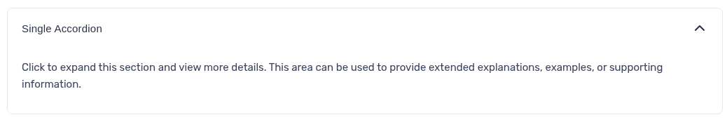
<Accordion title="Single Accordion">
  Click to expand this section and view more details. This area can be used to
  provide extended explanations, examples, or supporting information.
</Accordion>
Accordion Group
- Syntax
- Preview
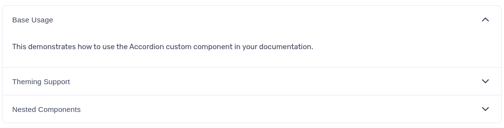
<AccordionGroup>
  <Accordion title="Basic Usage">
    This demonstrates how to use the Accordion custom component in your
    documentation.
  </Accordion>
  <Accordion title="Theming Support">
    Accordions automatically adapt to Light, Dark, and Cosmos themes, ensuring
    visual consistency across the portal.
  </Accordion>
  <Accordion title="Nested Components">
    You can include other custom components like Callouts or Lists inside an
    Accordion for richer content.
  </Accordion>
</AccordionGroup>
Info
💡 For full configuration details, see the API Developer Portal Custom Components Documentation.