This change log encompasses three significant enhancements aimed at streamlining user experience across our platform:
- Streamlining Table of Content in the Documentation.
- Improving the Get SDK Experience.
- Enhancing the experience of the Language Selector.
Streamlining Table of Content in the Documentation
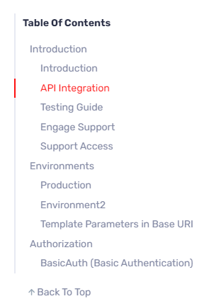
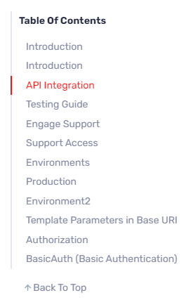
Previously, headings in markdown were being represented in two levels giving an incorrect sense of hierarchy of the document. Now, all headings are displayed flatly, simplifying browsing and improving user experience.
- Before
- After


Improving the Get SDK Experience
Here is the list of improvements:
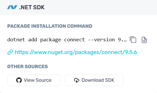
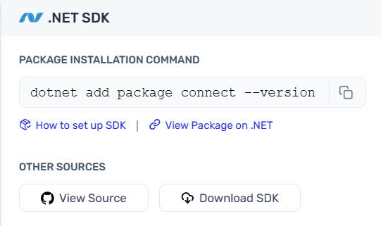
- The installation command box has undergone a makeover, now featuring a sleek design with the installation command and a convenient copy button side by side.
- The Guide icon has been relocated and redesigned as a hyperlink labeled “How to setup SDK,” providing clearer guidance.
- We’ve fine-tuned the spacing between the package installation command and other sources for improved visual grouping.
- Before
- After


Enhancing the experience of the Language Selector
Bid farewell to confusion with our Language Selector’s scroll arrows. Previously, users encountered frustration when the scroll reached its extreme positions, as the arrows failed to indicate this state. Now, with our latest update, the left arrow disables when the scroll is at the extreme left, and similarly, the right arrow disables when the scroll reaches the far right.

Why these matter ?
These enhancements collectively prioritize user accessibility, efficiency, and satisfaction and also aims to provide a seamless and intuitive experience for our users. These improvements contribute to a more user-friendly platform, ultimately enhancing productivity and satisfaction.