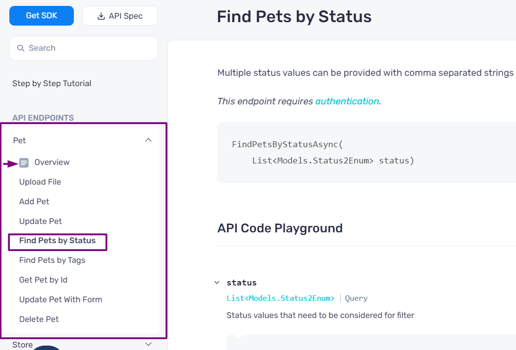
APIMatic's developer portal now offers a better visibilty experience with UI changes to the left naviagtion bar. These include indentation of menu items, bold titles and highlighting of selected section in the navigation bar.
All endpoints listed under a group and any structures and models have a left indentation in the sub-meu items to distinguish the header. The section is also highlighted with the selected link boldened, so it is easy to quickly see from the navbar which section of the documentation is opened in the main pane.
Previously, all main items and sub-items used to have the same look and feel, so it would be hard to find which part of the documentation was being viewed, especially if there was a large number of menu items. But highlighting the whole section in the navbar, and indentation in the sub-menu items makes it easy to track the documentation.
