Custom Components Support for API Developer Portal
The API Developer Portal supports custom components within Markdown files to enhance documentation structure and interactivity.
Why Use Custom Components?
Standard Markdown provides basic text formatting but lacks structure for complex documentation needs. Custom components address these limitations:
- Improved organization - Group related content using tabs and accordions instead of lengthy, single-page sections
- Enhanced readability - Use callouts to highlight critical information that developers might otherwise miss
- Reduced maintenance - Consistent component styling eliminates the need for custom HTML and CSS scattered throughout documentation
- Better user experience - Interactive elements like collapsible sections help users find relevant information faster
- Consistent styling - Standardized components ensure uniform presentation across all documentation page
Syntax Requirements
Critical formatting rules:
- Keep component tags on single lines to prevent rendering failures
- Don't break component properties across multiple lines
- Follow the syntax patterns shown in examples exactly
// Correct
<Tab title="Example">
  Content
</Tab>

// Incorrect - will cause rendering issues
<Tab
  title="Example">
Content
</Tab>
Available Components
Below is a list of custom components supported in the API Developer Portal, along with examples and their usage:
- Callouts: Highlight important messages with contextual styling options including info, warning, danger, and success states.
- Card & Card Group: Showcase key information in clean, grid-based layouts for organised content presentation.
- Tabs: Organise content into switchable sections for improved navigation and space efficiency.
- Code Block Group: Display code samples across multiple programming languages in organised, tabbed interfaces.
- Accordion/Accordion Group: Create collapsible sections to organise content hierarchically and improve page readability.
- Frame: Embed images with captions and enhanced visual demonstrations.
- Video: Embed videos seamlessly from YouTube and Vimeo platforms.
- Mermaid: Visualise workflows, system architecture, and complex processes through interactive diagrams.
Callouts
Display contextual alerts and notices.
- Syntax
- Preview
<Callout type="success">
  This is a general callout to highlight important information.
</Callout>

Properties:
type(string, optional): info (default), success, warning, dangerchildren(string, required): Alert content
Card & Card Group
Present structured information blocks.
Single card
- Syntax
- Preview
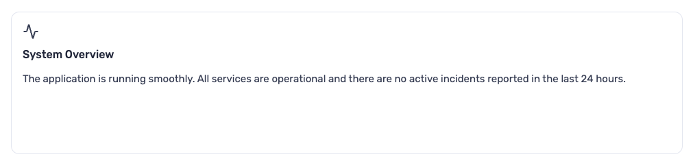
<Card title="System Overview" icon="Activity">
  The application is running smoothly. All services are operational and there
  are no active incidents reported in the last 24 hours.
</Card>
Card Group
- Syntax
- Preview
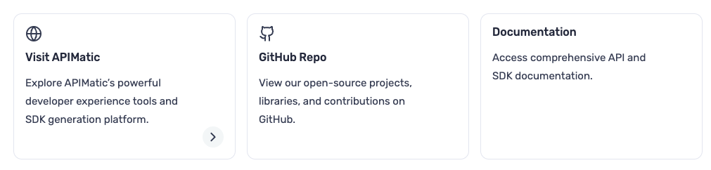
<CardGroup cols={3}>
  <Card title="Visit APIMatic" icon="Globe" url="https://apimatic.io">
    Explore APIMatic’s powerful developer experience tools and SDK generation
    platform.
  </Card>
  <Card title="GitHub Repo" icon="Github">
    View our open-source projects, libraries, and contributions on GitHub.
  </Card>
  <Card title="Documentation">
    Access comprehensive API and SDK documentation.
  </Card>
</CardGroup>
Properties:
Card:
title(string, required): Card headericon(string, optional): Lucide icon nameurl(string, optional): Makes card clickablechildren(string, required): Card content (text only)
Card Group:
cols(number, required): Grid columns (1-4)children(Card[], required): Card components
Tabs
Organize content into switchable views. Tab component support rich content including text, code blocks, lists, callouts, and other nested components.
- Syntax
- Preview
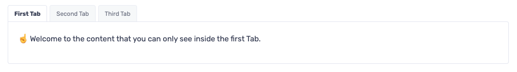
<Tabs>
  <Tab title="First Tab">
    ☝️ Welcome to the content that you can only see inside the first Tab.
  </Tab>
  <Tab title="Second Tab">✌️ This is inside the second tab.</Tab>
  <Tab title="Third Tab">👌 Here's something in the third tab.</Tab>
</Tabs>
Properties
Tabs: No properties, contains Tab childrenTab:title(string, required): Tab labelchildren(string, required): Tab content
Code Block Group
Group related code examples in tabbed interface.
- Syntax
- Preview
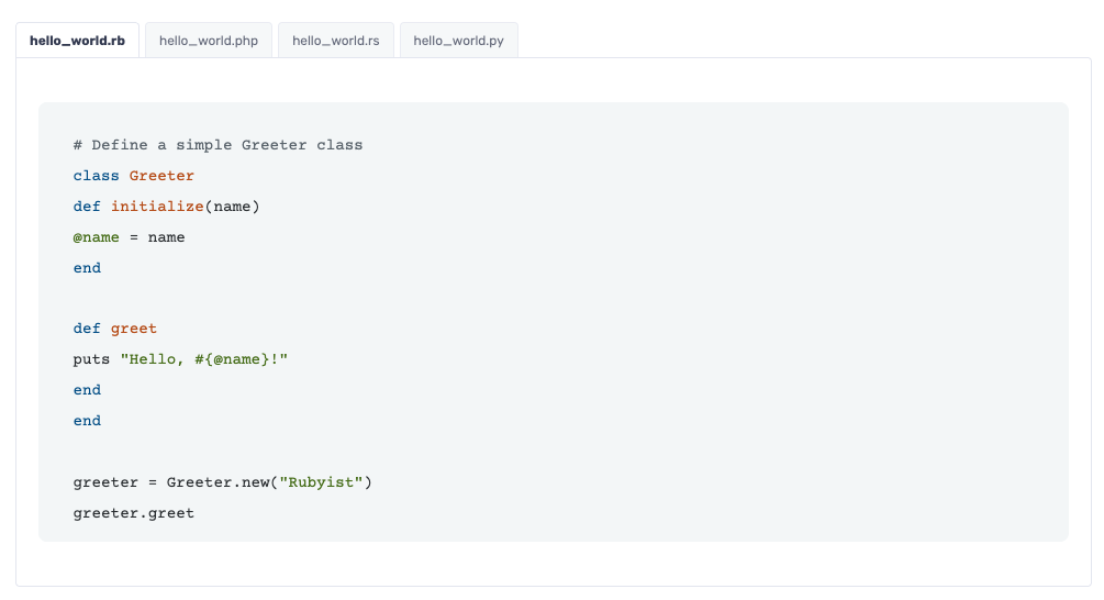
<CodeBlockGroup>
```ruby hello_world.rb
# Define a simple Greeter class.
class Greeter
  def initialize(name)
    @name = name
  end

def greet
puts "Hello, #{@name}!"
end

end
greeter = Greeter.new("Rubyist")
greeter.greet
```

```php hello_world.php
<?php
function greet($name) {
  echo "Hello, $name!";
}
greet("Developer");
?>
```

```rust hello_world.rs
fn greet(name: &str) {
    println!("Hello, {}!", name);
}

fn main() {
    let name = "Rustacean";
    greet(name);
}
```

```python hello_world.py
class Greeter:
    def __init__(self, name):
        self.name = name
    def greet(self):
        print(f"Hello, {self.name}!")
greeter = Greeter("Pythonista")
greeter.greet()
```
</CodeBlockGroup>
Properties
children(codeblock[], required): Fenced code blocks with language and filename.
Each code block inside must use standard Markdown fenced syntax:
language filename. The filename serves as the tab label.
Accordion / AccordionGroup
Create collapsible content sections.
Single accordion
- Syntax
- Preview
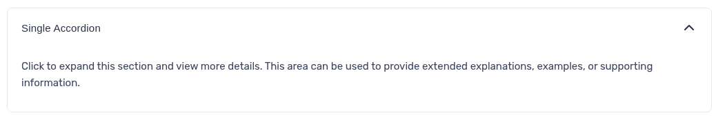
<Accordion title="Single Accordion">
  Click to expand this section and view more details. This area can be used to
  provide extended explanations, examples, or supporting information.
</Accordion>
Grouped Accordions
- Syntax
- Preview
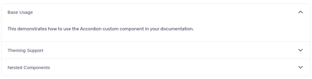
<AccordionGroup>
  <Accordion title="Basic Usage">
    This demonstrates how to use the Accordion custom component in your
    documentation.
  </Accordion>
  <Accordion title="Theming Support">
    Accordions automatically adapt to Light, Dark, and Cosmos themes, ensuring
    visual consistency across the portal.
  </Accordion>
  <Accordion title="Nested Components">
    You can include other custom components like Callouts or Lists inside an
    Accordion for richer content.
  </Accordion>
</AccordionGroup>
Properties
- Accordion
title(string, required): Header textchildren(string, required): Collapsible content
- Accordion Group
children(Accordion[], required): Multiple Accordion components
Frame
Wrap images with optional captions.
- Syntax
- Preview
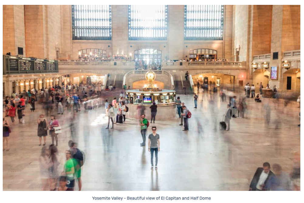
<Frame caption="Yosemite Valley - Beautiful view of El Capitan and Half Dome">
  <img src="https://picsum.photos/id/800/1280/800" alt="Yosemite Valley" />
</Frame>
Properties
caption(string, optional): Image descriptionchildren(image, required): Single<img>element
Video
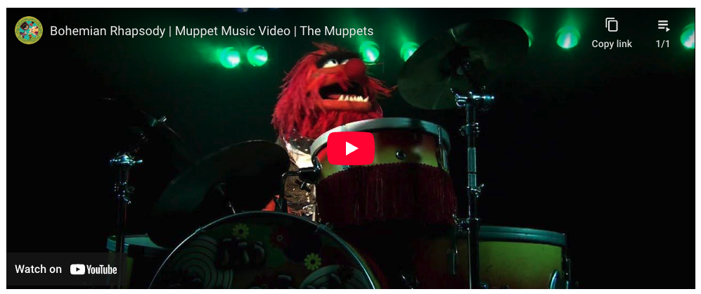
Embed video content from supported platforms (YouTube and Vimeo).
- Syntax
- Preview
<Video url="https://www.youtube.com/embed/tgbNymZ7vqY?playlist=tgbNymZ7vqY&loop=1" />
Properties
url(string, required): YouTube embed or Vimeo player URL
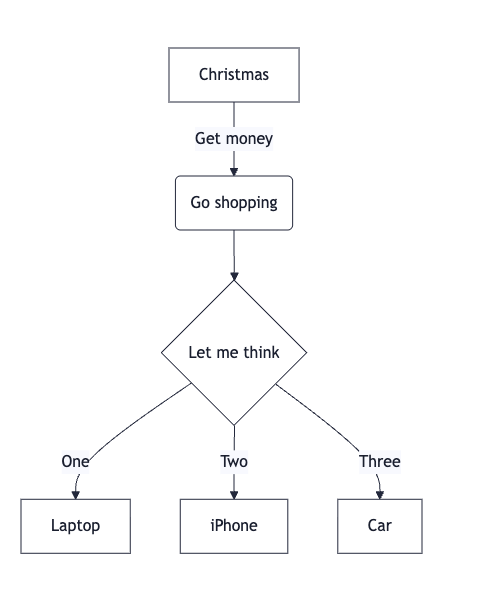
Mermaid
Render diagrams using Mermaid syntax.
- Syntax
- Preview
```mermaid
flowchart TD
  A[Christmas] -->|Get money| B(Go shopping)
  B --> C(Let me think)
  C -->|One| D[Laptop]
  C -->|Two| E[iPhone]
  C -->|Three| F[fa:fa-car Car]
```
Properties
children(string, required): Mermaid diagram syntax